How colors interact with each other, what emotions do they evoke, that is what studies color theory. Let’s take a look!
Color is one of the fundamental parts of art – it can be used to evoke emotions, bring the whole piece together. Different colors interact with each other in different ways, many of them combine in ways soothing to the picture, while bad usage of colors can ruin the whole piece.
The base, most important element of color theory is the color wheel. This wheel represents all the main colors and how they interact with other parts of the color wheel.
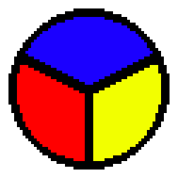
What you see here is the color wheel of the three primary colors – red, blue and yellow. These are the colors that, in traditional color-use, cannot be created by mixing other colors. All of the other colors have the roots in combining these three, primary colors.

This is the secondary color wheel – we added three new colors, which were created by mixing the primary ones. The secondary colors are – green, purple and orange.

The tertiary color wheel includes colors made by mixing a primary and a secondary color. This is the most complex of the color wheels. Now, these three are my renditions and I’m sure you will find many others on the internet, however, they will follow a similar pattern as my wheels.
All of these color wheels are made in order to serve as guidelines for creating color harmony. Harmony, as I’m sure you know, is something in a pleasing arrangement – humans tend to like harmonious things.
When creating a picture, be sure to look at a color wheel from time to time and use complementary, or analogous colors.
Complementary colors are the ones directly opposite on the color wheel. For example, if you look at the tertiary wheel, it would be these two colors:

When used together, complementary colors create high contrasts, that are, however, not hard to look at.
On the other hand, there are analogous colors. These are the colors that are adjacent on the color wheel. Usually, three colors are used together, one of them being dominant in the piece.
As I mentioned before, colors do interact with others and they behave differently in different environments.

I’m sure you’ve seen this one before. The two small squares in the middle are the same color, but you see them slightly different because they are surrounded by different colors.
Overall, color is a fundamental part of every art piece and I could talk about for many hours to come, but I think this would suffice for now – after all, this is an article explaining the fundamentals of art. Next up on the list is composition!
Did I miss anything important about color theory? How have you used its knowledge? Feel free to post any feedback to the comments!